Logo Description
Welcome to 823 Logo Description & Philosophy
Together For A Better Future
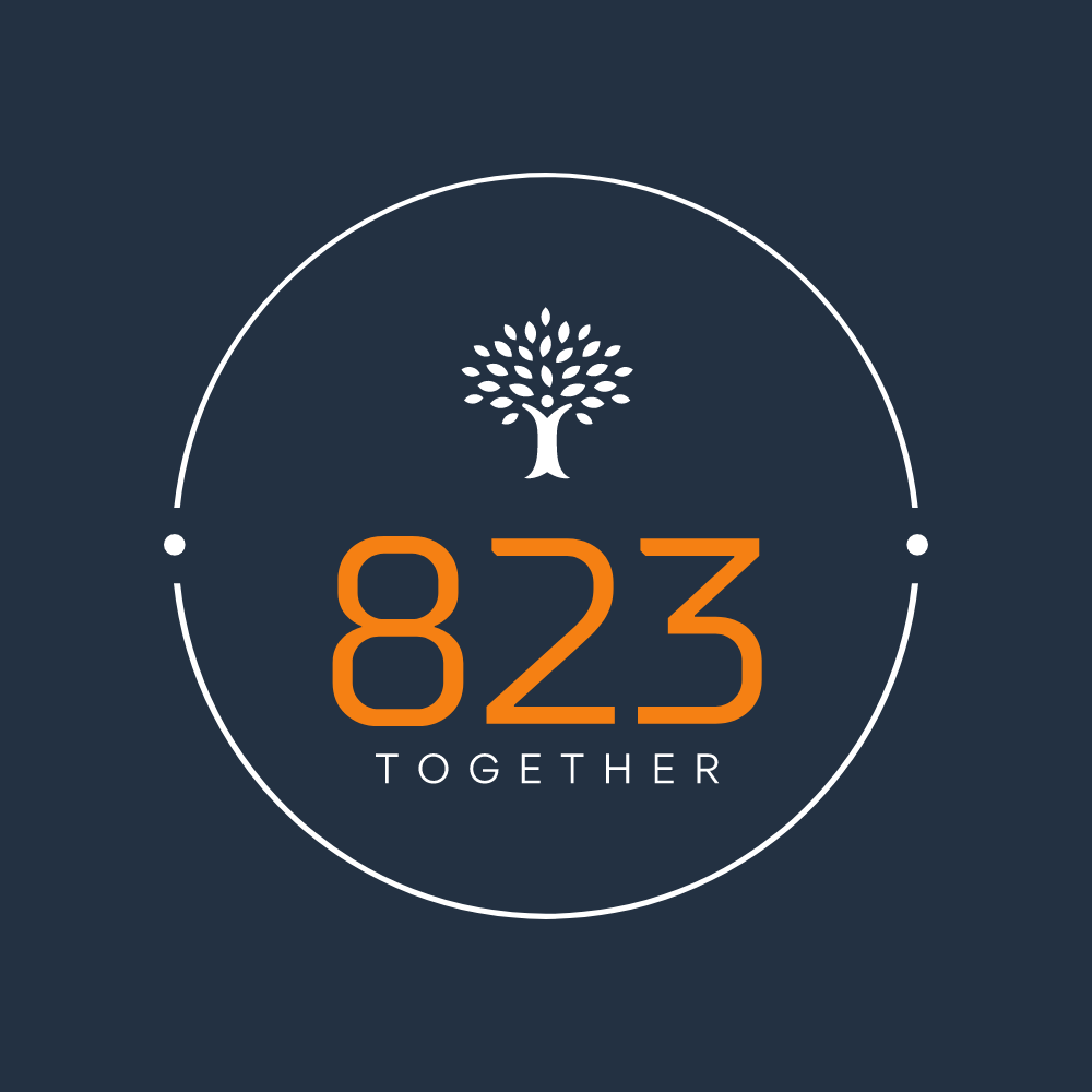
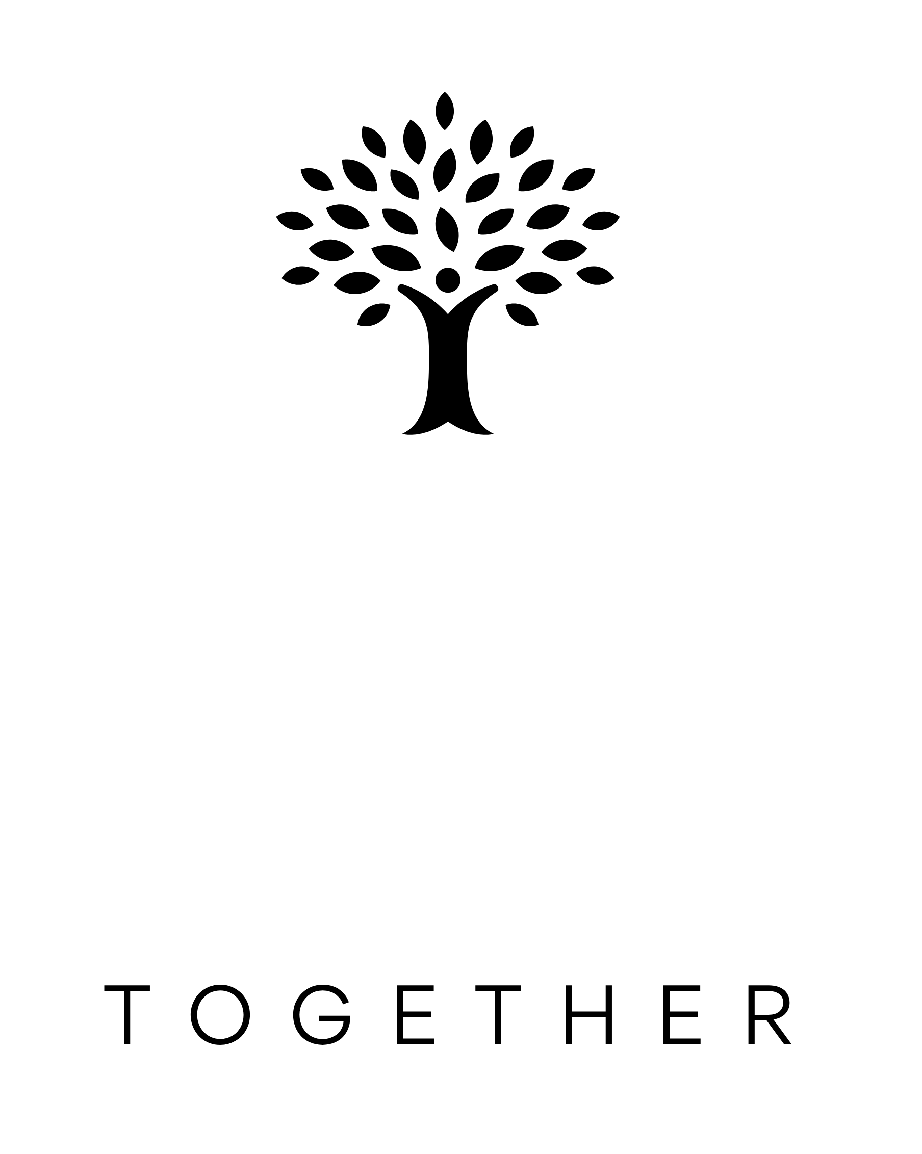
The 823 logo embodies a powerful depiction of unity and growth, as it features the word "together" positioned at the root of a robust, ever-expanding tree. Encircled by orbiting symbols, the logo commands attention with the number "823" in vibrant orange, prominently showcased at the center stage. Against a deep blue backdrop, a hint of green emerges from the darkness, representing hope and vitality. This carefully crafted logo harmonizes elements of strength, collaboration, and a promising future, all within its captivating design.
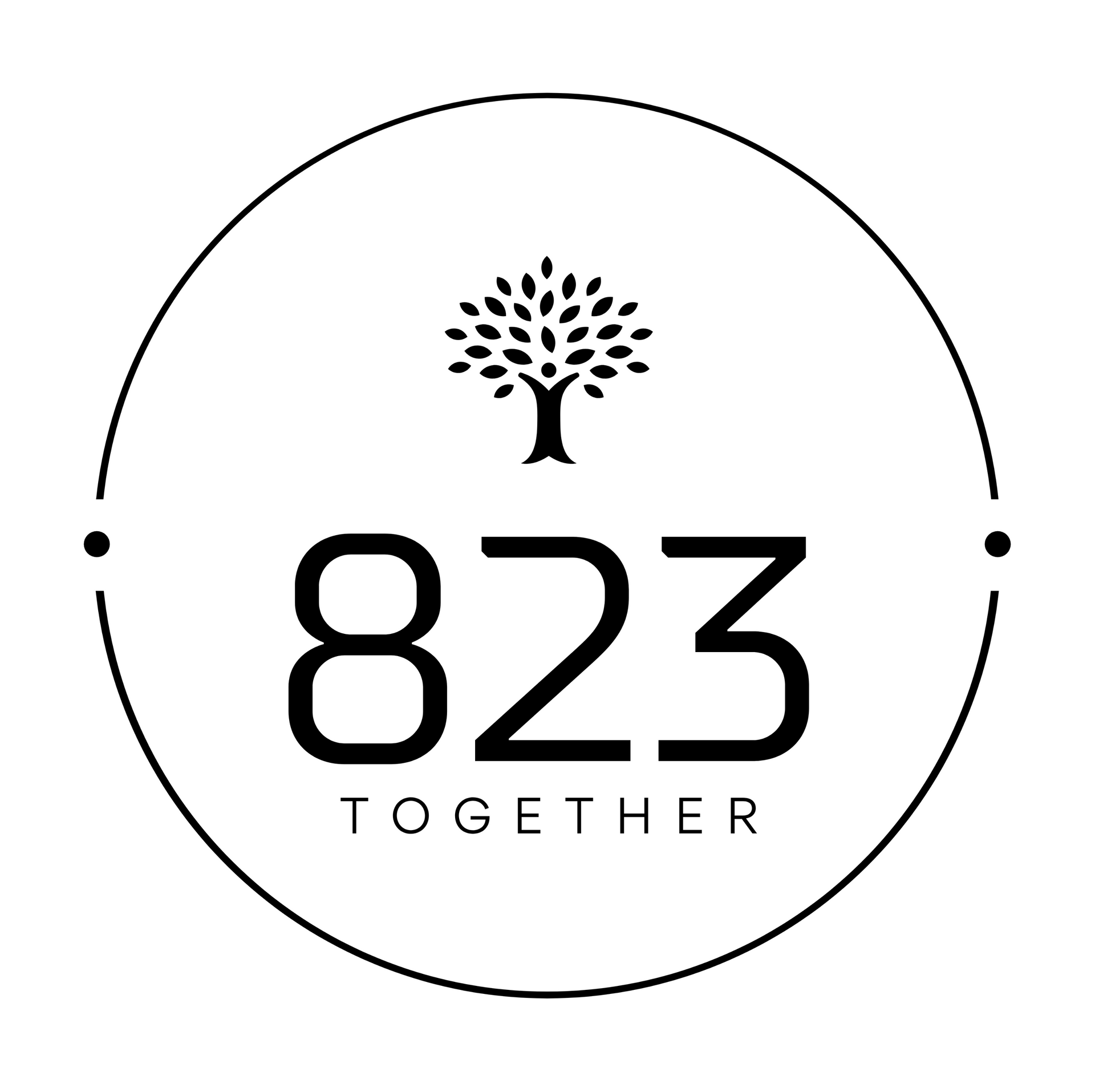
Presenting an alternative approach, the monocolor logo design offers a streamlined aesthetic. This minimalist design employs a single color scheme, eliminating any distracting visual elements. It maintains the essence of the original concept while embracing a clean and cohesive appearance. The focus remains on the central elements, such as the word "together" at the root of the tree and the orbiting symbols, creating a visually impactful representation. Whether in vibrant orange, deep blue, or any other chosen color, the monocolor logo retains its ability to convey the core message with simplicity and elegance.
823
As an emblem of significance, Eight Twenty-Three encapsulates the essence of a momentous event that transpired in August 2023.
Together
At the core of our mission lies the unwavering commitment to sustainable growth, a journey that can only be accomplished through the power of unity and collective endeavors. Our logo features a symbolic tree, embodying our company's essence, while its flourishing leaves reflect our expanding business. The sturdy stem serves as a representation of the robust infrastructure and systems that underpin our operations. At the very foundation of this profound symbol, you will find the word "Together," anchoring our values and aspirations.
Perseverance
The circular logo design elegantly portrays two orbiting dots, mirroring the perpetual motion of the sun's daily cycle. This symbolic representation serves as a powerful reminder of the enduring nature inherent in business and economic cycles. It signifies that despite facing challenging circumstances, these cycles inevitably evolve, leading to renewed prosperity. Moreover, the logo's enduring symbol also signifies the constant advancement of emerging technologies, gradually rendering older counterparts closer to the precipice of obsolescence.
Energetic Sun Rise
Enrich the logo design with the captivating orange color, infusing it with a dynamic vitality that mirrors the radiant energy of a sunrise. This evocative choice captures the profound essence of the dawn emerging from the depths of a dark night, symbolizing new beginnings and boundless possibilities.
Emergence of Game Changing Technologies
Integrate the deep blue/green color into the background, symbolizing the evolution and emergence of transformative game-changing products and services. This harmonious blend of blue and green hues represents a steadfast commitment to environmental sustainability and the nurturing of a green ecosystem.
